
TABLE OF CONTENTS
Introduction
This article describes the modern approach to get rid of annoying design issues that can blow your mind. Fortunately there are new additions to the CSS standard that help solve them!
CSS is what makes websites look cool and work smoothly. In the big world of web development, CSS is like the magic ingredient that gives websites their style and structure.
CSS isn’t static. Nope, it’s always changing and improving. Every now and then, they add new stuff to CSS to make it even cooler. And for us web developers, it’s super important to stay on top of these changes.
Why, you ask? Well, because these new CSS tricks help us make websites that not only look awesome but also work really well. Whether it’s making our sites fit perfectly on different screens or adding fancy scrolling effects, staying in the loop with CSS trends is key to building websites that people love to use.
Now, let’s dive into some of the latest CSS goodies and see how they’re shaking things up in the web design world. We’ll break down what each new feature does and show you how to use them in your own projects. I’ll also show examples from real cases, so get ready to level up your web design game as we explore the exciting world of CSS innovations!
Symbols SVH/LVH/DV – Who are they?
Alright, now let’s step back and ask ourselves: why do we need new ways to measure stuff when we already have VH, VW, VMIN, VMAX, percentages, and the calc function? For the past 12 years, these methods have been doing a stellar job at sizing up elements. So, first things first, let’s explain what these units are:
- VH (viewport height) represents a percentage of the visible area’s height. For example, if you set an element’s height to 50vh, it’ll take up 50% of the page’s visible height.
- VW (viewport width) represents a percentage of the visible area’s width. For example, if you set an element’s width to 25vw, it’ll occupy 25% of the visible area’s width.
- VMIN (viewport minimum) uses the smaller value between the height and width of the visible area. For example, if the visible area’s height is smaller than its width, 1vmin would be equivalent to 1% of the visible area’s height.
- VMAX (viewport maximum) uses the larger value between the height and width of the visible area. For example, if the visible area’s height is larger than its width, 1vmax would be equivalent to 1% of the visible area’s height.
These units were originally designed to make websites look great on all screens. However, things have changed over time. Mobile browsers started doing their own thing with how they display elements like the address bar. Safari moved it to the bottom, while Chrome kept it at the top. This created a headache for developers trying to create sites that looked good everywhere.
Right now, there are tons of layout issues, especially on mobile devices, all because of that pesky address bar. Unfortunately, there’s still a bunch of old code lingering around, but clients want their apps to stand out on the newest devices. Honestly, that’s why I decided to write this article. It would be fantastic to demonstrate how to hook these problems with minimal effort.
Think about it: you’re making a button that asks people to agree to something. If you use vh, that button might end up hidden behind the address bar on some phones. Not cool, right?
So, CSS stepped in with SVH, LVH, and DVH. Here’s the deal:
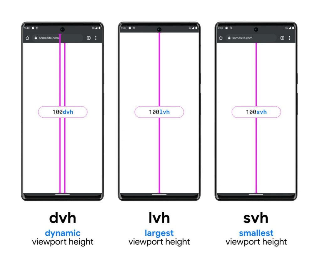
- DVH (dynamic viewport units) switches between svh and lvh depending on whether the address bar is big or small.
- LVH (large viewport units) tells us the height after the address bar shrinks.
- SVH (small viewport units) tells us the height of the screen before the address bar gets smaller.
No worries, I know it would be better to have a visual aid to understand how it works. Here is the example:
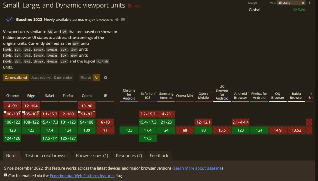
And the best part? These units work the same across different browsers (caniuse)
So now, thanks to SVH, LVH, and DVH, we can make websites that adapt smoothly to any device. No more worrying about stuff getting in the way of important buttons. Nice, huh? Here you could find other units for any case, enjoy!
MEDIA QUERIES – NEW MEDIA QUERIES SYNTAX
Alright, let’s switch gears and talk about media queries – the new syntax for media queries. How often do you use the same syntax? In the old code
@media all screen and (max-width: 600px) {
	background-color: red;
}
This is not a huge but very useful change that allows for a clearer syntax in media queries. The usual syntax for media queries looked like this:
@media (1000px <= width <= 600px) {
	background-color: red;
}
@media (width <= 600px) {
background-color: red;
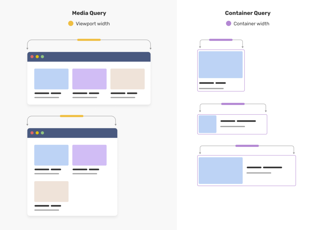
}As of 2024, container queries are supported in all major browsers. But what are they? Container queries allow us to check the size of an element’s container and adjust styles accordingly. This is a big deal because it means we’re not limited to just checking the viewport size like we do with media queries. With container queries, we can get more precise with our layout, potentially making our code simpler and easier to manage.
@container CONTAINER_NAME (width <= 600px) {
	background-color: red;
}
Of course here is a picture to see the updates:
Now, let’s have a look at the key features.
CONTAINER UNITS allow us to size elements relative to their container, rather than the viewport. For example, we can specify padding or font size using container units, making our layouts more flexible.
@container (min-width <= 600px) {
  .header h2 {
    font-size: max(1.5em, 1.23em + 2cqi)
  }
}
STYLE QUERIES can check an element’s styles applied with custom properties. This means we can apply different styles based on custom properties set in our markup.
@container style(--featured: true) {
  article {
    border-radius: 0.2em;
    background: pink;
    border: 1px solid deeppink;
    font-size: max(1.5em, 1.23em + 2cqi)
  }
}
<div class="grid-container">
<ul class="grid">
<li class="article-container">...</li>
<li class="article-container">...</li>
<li class="article-container" style="--featured: true">...</li>
</ul>
</div>So, what do you think? Do we still need media queries? – Yes, we do. While container queries are great for layout, media queries still have their place. They’re useful for querying things other than size, like user preferences for motion or color scheme.
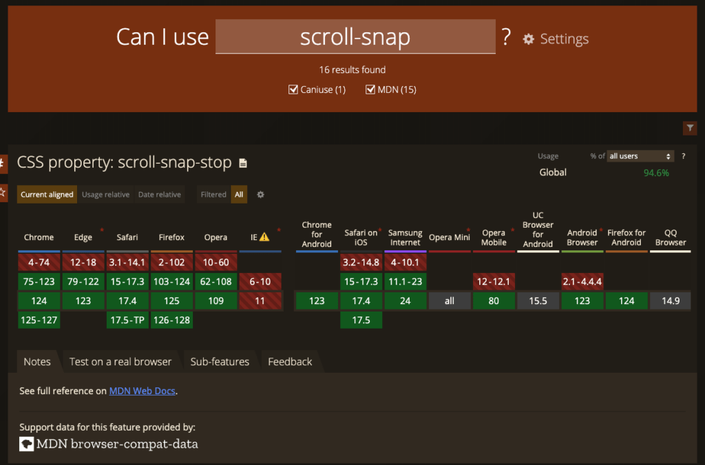
CSS SCROLL SNAP
Alright, let’s wrap things up with a quick chat about CSS Scroll Snap.Have you ever experienced that while scrolling through websites on your mobile device, sometimes the scrolling stops abruptly, while on other sites it’s smooth and seamless? Isn’t it frustrating when you’re scrolling down a page and it stops unexpectedly, cutting off a paragraph or an image? This happens because scrolling lacks precision by default. For a while, developers had to resort to using JavaScript to gain better control over scrolling behavior.
This is the second reason why I decided to write this article. This property really helps if a developer needs to implement the same logic without any additional lib. Recently, CSS scroll snap has become a popular choice among developers for achieving a smoother and more controlled scrolling experience.
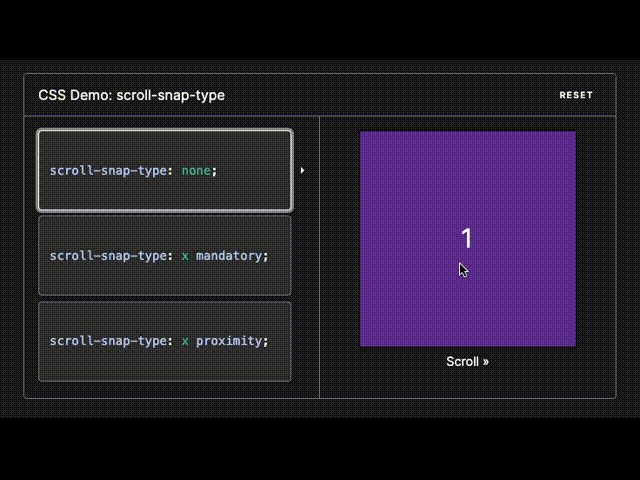
And this CSS property has the same amazing support.
FUNCTIONS CLAMP
Okay, last but not least, have a look at functions clamp, min, max. These functions offer a way to determine element sizes dynamically. Within them, calculations can be performed similar to calc.
The min function selects the smallest value among the provided options. It accepts multiple values. For instance, if you specify 50vw and 500px, and the viewport size is 1400px, it will use 500px because 1400/2 (50vh is equal 50% in this case) equals 700px, and 500px is less than 700px. However, if the viewport size drops below 1000px, it will switch to using the value of 50vw.
.element {
  width: min(50vw, 500px);
}
.element {
  width: max(10em, 30%, 30px);
}
These functions also allow for comparing relative values. Similarly, the max function operates, but it returns the maximum value.
Lastly, clamp sets the value between specified upper and lower bounds.
.element {
  width: clamp(250px, 100%/3, 900px);
}
The width of the element will be calculated based on the formula 100% / 3, as long as it remains within the range of 250px to 900px.
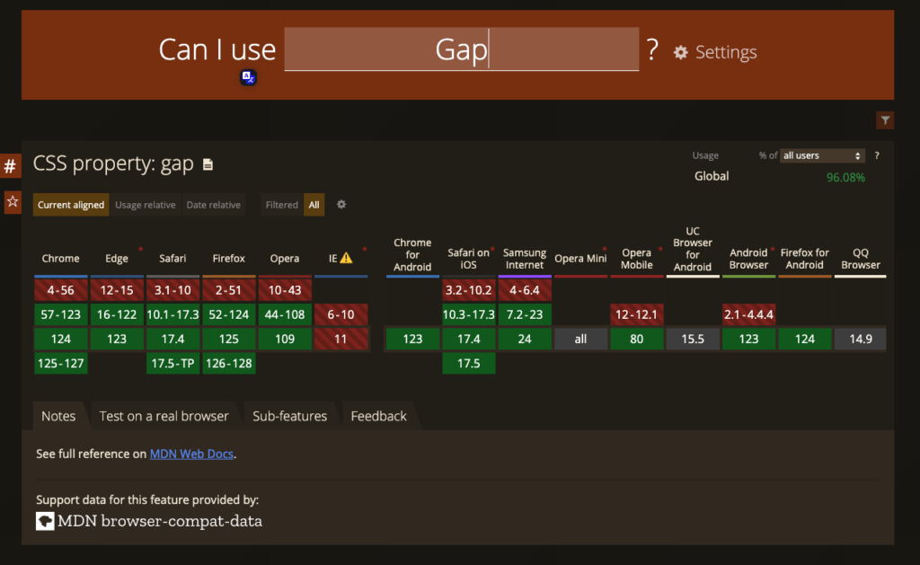
SPACE BETWEEN ROWS AND COLUMNS
The gap property in CSS serves as a shorthand for row-gap and column-gap, defining the size of gutters, which represent the space between rows and columns within grid, flex, and multi-column layouts.
When a single value is provided, it sets both row-gap and column-gap to the same value. However, when two values are specified, the first one sets the row-gap, while the second one sets the column-gap.
This is the third reason why I decided to write this article. When using gap, you don’t have to worry about the margins of the outer elements or how they’ll behave on mobile devices when elements stack on top of each other – gap takes care of it all automatically. Often, you don’t even need to write an additional media selector because you can use the formulas described above along with this fantastic property.
CSS Nesting
One more cool feature for people who are happy to use clean CSS without any pre/post-processors. Finally, CSS lets you use nesting with the symbol &. If not used in the nested style rule, the & nesting selector represents the scoping root.
.card {
  /* .card styles */
  .featured & {
    /* .featured .card styles */
  }
}
/* the browser parses above nested rules as */
.card {
  /* .card styles */
}
.featured .card {
  /* .featured .card styles */
}
/* old implementation */
.example {
font-family: system-ui;
font-size: 1.2rem;
}
.example > a {
color: tomato;
}
.example > a:hover,
.example > a:focus {
color: ivory;
background-color: tomato;
}/* new implementation */
.example {
font-family: system-ui;
font-size: 1.2rem;
& > a {
color: tomato;
&:hover,
&:focus {
color: ivory;
background-color: tomato;
}
}
}This feature removes the need to keep mentioning the parent selector over and over again, which makes writing CSS simpler and the code easier to read. The newest versions of popular browsers fully support CSS nesting.
CONCLUSION
With each passing year, CSS continues to evolve and become more powerful than ever before. We’re witnessing the emergence of numerous functions and features within CSS itself that were previously only possible through additional libraries or JavaScript. These modern CSS approaches are addressing significant challenges that were previously tackled using JavaScript solutions.
The continuous evolution of CSS is empowering developers to create a more experienced and responsive web without relying heavily on external libraries or JavaScript. With the growing arsenal of CSS features and functions, the possibilities for web design are expanding, allowing developers to push the boundaries of creativity and innovation like never before.
By Mikita Klepanosau, Software Developer at Klika Tech, Inc.