TABLE OF CONTENTS
In today’s Internet of Things (IoT) game, data is the real MVP (the most valuable player). IoT devices are on a non-stop mission to collect all sorts of info, from weather data to gadget statuses and even your personal well-being stats. But here’s the kicker: the real magic happens when we turn all that data into something we can actually understand. And that’s where data visualization comes into play. So, in this article, we’re going to reveal the truth and explain why data visualization is such a big deal in IoT, and break down the different types of data we can dig into using visualization tools.
THE DEAL WITH DATA VISUALIZATION IN IOT
Now, before we dive into the nitty-gritty of the types of data we can visualize, let’s talk about why this whole data visualization thing is so crucial in the world of IoT.
- CLARITY: data visualization is like putting on your glasses for complex datasets. It makes things clear and simple for all of us, even if you’re not a data guru. It takes raw data and turns it into pictures that our brains can quickly understand and act upon;
- SPOTTING TRENDS AND PATTERNS: it’s like having a magnifying glass for hidden trends and patterns in your data. Things that might hide in boring old tables become super obvious when we put them in charts and graphs. And this isn’t just about making data pretty; it’s about predicting things and stopping problems, like equipment breakdowns or funky weather shifts;
- INFORMED DECISION-MAKING: data visualization is like the Sherlock Holmes of decision-making. Instead of relying on gut feelings or making wild guesses, we base our decisions on hard facts. In areas like healthcare and industry where precision is the name of the game, data visualization is a must;
NAVIGATING THE IOT DATA WORLD
Now, picture this: You’re into an IoT project, and you’re all about saving energy. Well, you’d want to keep a sharp eye on energy consumption, right? It’s like checking your monthly electricity bill at home, but in this case, we’re looking at how electric car charging stations are using power over time. This helps us find ways to save energy, make our batteries last longer, and get better at managing power.
But, before we jump into the world of visualizations, let’s first sort out the different types of data that we usually play with in IoT. Here are the big categories:
NUMERIC is the kingpin in IoT, covering all the numbers we collect from sensors. Think of things like air temperature, humidity, or light levels. To make sense of numeric data, we use line charts, bar graphs, and histograms. They’re like our detective tools for checking out trends and how things change over time;
CATEGORICAL is about putting things into different categories or classes. It’s like sorting devices by type (sensors, smart gadgets, etc.), dividing places into regions, or breaking down data by time (morning, afternoon, evening, night). To make sense of this kind of data, we turn to bar charts, pie charts, and heatmaps. They help us see the differences and group things;
TIME SERIES is like a history book of measurements taken at different times. It’s super important in IoT for tracking changes over time. Think about hourly temperature records or daily humidity levels. To show time series data, we use line charts, candlestick charts, and scatter plots. They give us a peek into trends, seasonal ups and downs, and weird surprises;
GEOLOCATION is all about where devices are and where they’re going. It’s golden for tracking objects or vehicles. To work with geolocation data, we use route maps, point maps, and heatmaps. They show us where things are moving and where the action is;
DEVICE STATE is about the health of IoT devices. It tells us if they’re happy, sad, or somewhere in between. Device status, network connections, and other bits are in here. To make sense of this, we use status diagrams, pie charts, and good old tables. It helps us see what’s going on with our devices in real time;
ENERGY CONSUMPTION is a big deal in IoT, especially for battery-powered devices. When we visualize energy use patterns, it’s like knowing when your wallet feels lighter. We use line charts, bar graphs, and heatmaps to spot the busy times, weird spikes, and how settings affect power use;
Alright, now let’s dive into these types of data and check out the cool charts and graphs we use to make sense of them.
LINE CHART
Description
In the IoT world, line charts take on the role of storytellers for numeric data. They show us how numbers change over time. Think of it as tracking temperature or humidity levels throughout the day. Line charts are like our trusty detectives for spotting trends and changes in IoT data, which helps us make smarter decisions.
Data types used
Numeric, time series, energy consumption
BAR CHART
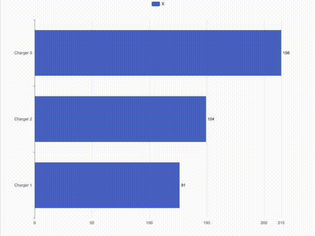
Description
When you want to compare numbers across different categories, bar charts are your go-to pals. They can rank the energy use of different IoT devices and aid in the understanding of how regions consume power. Bar charts take the complexity out of data and make it easy to see what’s happening.
Data types used
Numeric, categorical, energy consumption
HEATMAP
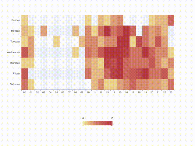
Description
Heatmaps function similarly to high-tech heat-sensing cameras, but they’re used for data visualization. They help us see where things are hot and where they’re not. Imagine checking a weather map for hot and cold spots. In the IoT world, heatmaps help us understand data patterns and connections, whether it’s about energy use or locations.
Data types used
Numeric, categorical, energy consumption, geolocation
PIE CHART
Description
Pie charts are all about showing how different parts make up a whole. Think of it as dividing the energy consumption pie to see which slice is the biggest. Pie charts make complex data easy to digest and help us make informed decisions.
Data types used
Categorical, device state
SCATTER PLOT
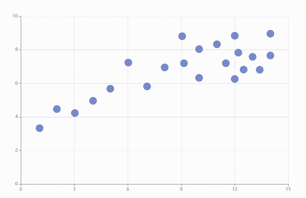
Description
Scatter plots act as data matchmakers, bringing together different variables to reveal potential connections.They help us figure out if one thing affects another. It’s like checking if taller people have bigger feet. In IoT, it’s about seeing if more powerful chargers lead to quicker charging times for electric vehicles. Scatter plots show us connections that aren’t obvious in raw data.
Data types used
Numerical, time series, categorical
CANDLESTICK CHART
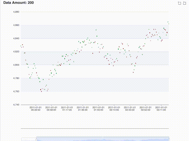
Description
Candlestick charts are like the stock market trackers of IoT. They help us follow price changes over time, just like keeping an eye on your favorite stock’s value. In the IoT world, candlestick charts show us how energy prices move, helping us make data-driven decisions about resource use and device efficiency.
Data types used
Numerical, time series, categorical
ROUTE MAP

Description
A route map is your guide to tracking objects or events on a map. It’s like following your friend’s road trip on a map. In the IoT world, it helps us see where devices are moving and where events are happening. This makes the IoT landscape clearer and more understandable.
Data types used
Geolocation, time series
POINT MAP
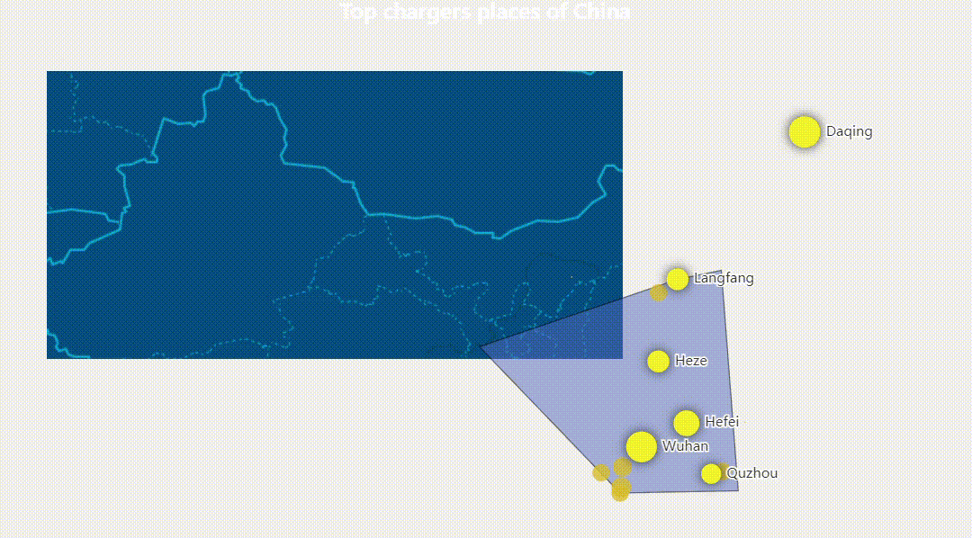
Description
A point map is like putting pins on a map to mark important spots. In IoT, it’s about showing the exact locations of charging stations in the city. It makes it easy for people to find those charging spots.
Data types used
Geolocation
STATUS DIAGRAM
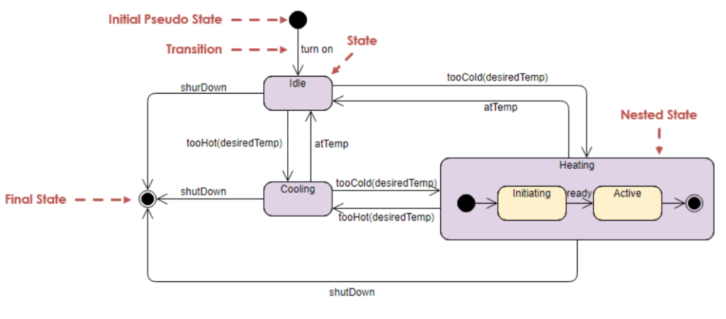
Description
Status diagrams function as a health check for IoT devices, ensuring they’re in optimal condition. They show us how devices are doing, like checking if your electric vehicle charger is ready for action. This visual representation makes real-time monitoring and issue-spotting a breeze.
Data type
Device state
TABLE
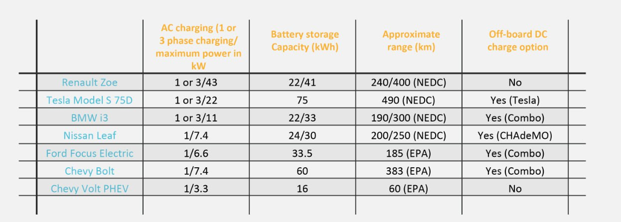
Description
Tables are your data organizers. They put info in rows and columns, making it easy to understand. In IoT, it’s like making a list of all the devices with their vital info. Tables keep things structured and help with device monitoring.
Data types used
Device state
CONCLUSION AND INSIGHTS
In a nutshell, data visualization is your secret weapon in the IoT world. It takes confusing data and turns it into something you can actually use. So, whether you’re tracking trends, sorting categories, or figuring out what your IoT gadgets are up to, data visualization is your sidekick.
Here’s the lowdown on data categories and the types of visualizations they go with:
- NUMERICAL DATA: use line charts, bar graphs, and histograms to keep an eye on trends and changes.
- CATEGORICAL DATA: grab bar charts, pie charts, and heatmaps to sort data into categories and spot differences.
- TIME SERIES DATA: call on line charts, candlestick charts, and scatter plots to see how things change over time.
- GEOLOCATION DATA: get the scoop with route maps, point maps, and heatmaps for tracking where your assets are moving.
- DEVICE STATE DATA: use status diagrams, pie charts, and tables for real-time monitoring of device health.
- ENERGY CONSUMPTION DATA: get savvy with line charts, bar graphs, and heatmaps to save energy and power up efficiency.
And that’s a wrap! Data visualization is your ticket to making sense of the IoT universe. It helps you make better calls and get awesome results on your projects.
By Mikita Klepanosau, Software Developer at Klika Tech, Inc.